The HelpStudio comes with some standard or default widgets that can be used while authoring the content for your topic.
Standard Widget Types
Widget Type
Description
Caution Box
This Content Widget inserts a box containing a cautionary note glyph. The content selected when this Content Widget is chosen is used as the note text.
Sample:
Some text that you would like to highlight in a caution box. The styles for the box are contained in the hs-boxes.css stylesheet that is automatically added to your project the first time this Content Widget is used.
Tip Box
This Content Widget inserts a box containing a tip glyph. The content selected when this Content Widget is chosen is used as the note text.
Sample:
Some text that you would like to highlight in a tip box. The styles for the box are contained in the hs-boxes.css stylesheet that is automatically added to your project the first time this Content Widget is used.
Note Box
This Content Widget inserts a box containing a note glyph. The content selected when this Content Widget is chosen is used as the note text.
Sample:
Some text that you would like to highlight in a note box. The styles for the box are contained in the hs-boxes.css stylesheet that is automatically added to your project the first time this Content Widget is used.
Expandable Text
The expandable text Content Widget converts the selected content into an expandable section. This Content Widget prompts you for the text you want to use as the expand link. At design time, the expandable text is highlighted with a light gray box outline to assist in editing.
The Drop Down Section Content Widget is similar to the Expandable Text helper but creates the expandable text as a drop down section (indicated by a bullet) that can be hidden again as well as shown.
Sample:
Click here to see
Some text and other content that is initially hidden.
Show All / Hide All Link
This Content Widget is a complement to the Expandable Text or Drop Down Section Content Widgets, inserting a 'Show All / Hide All' link that shows / hides all expandable and drop down sections in the Topic.
This Widget includes the entire body content of another Topic. This is a neat way to reduce duplication in your help content - common sections can be defined as Topics that are marked as not included in the output but referenced by an Include Topic widget in several places.
Dynamic Image
This Widget displays the selected image as a thumbnail image. Clicking on the thumbnail expands it (in place) to the full-size image. Once expanded, clicking 'CLOSE' shrinks the image back to its original thumbnail size.
Dynamic Image Widget Example
Colorized Example Code
The Colorized Example Code Widget makes it simple to include colorized example code in your content. Choose the language of your source code and work with the example code in the widget as you would any other content. When the Help System is built (or in preview) the source code is automatically colorized.
Colorized Example Code Section
This Widget includes Colorized Example Code "as is" without any wrapper.
// Some C# Code
if (this == "Some Value") {
that = true;
}
Colorized Example Code
The Colorized Example Code Widget also includes a 'Copy Code' link that can be used by users of your Help System to copy the contained sample code to the clipboard.
Sample VB Code
Copy Code
Dim obj asNew Customer
Customer.Name = "Joe Smith"
Customer.Save()
Sample HTML Code
Copy Code
<html><body><p>A sample page</p></body></html>
Colorized Example Code (Tab Style)
This variant of the Colorized Example Code Widget presents as a Tab Style.
Dim obj asNew Customer
Customer.Name = "Joe Smith"
Customer.Save()
Movie (Flash)
This Content Widget makes it easy to embed flash movies (SWF files) in your help content. The movie URL, size and background color can be directly edited in the widget at design time and the movie appears in preview and when the Help System is built.
Movie (YouTube)
This Content Widget makes it easy to embed YouTube movies in your help content. The movie ID, sizing, and secondary options can be set directly in the widget at design time and the movie appears in preview and when the Help System is built.
In this Topic List
This Widget is useful in long Topics, where you want to include a linked list of all the headings at the top of the topic. You can choose the heading tag to look for (default is H1).
The output produced by this Widget is a bullet list containing a list item linking to every heading in the Topic.
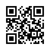
QR Code
This Widget outputs a QR Code image for some specified text. QR Codes are a kind of barcode that is readable from a printed page or a computer monitor by smartphones so are particularly useful for including links that a user can easily capture with their phone.
Tab Strip / Tab Item
The Tab Strip Widget, allows you to include a set of related content in a single space. To add tabs, insert a Tab Item Widget into the Tab Strip Widget for each tab you want to add. Users can click on a tab header to display the intended content.
Any content you can use elsewhere can be used here.
Content for Tab 2 goes here
Any content you can use elsewhere can be used here.
Example Code Tab Strip
This is a variant of the Tab Strip widget that allows you to include Colorized Example code for multiple languages. The tabs work with the Language Filtering feature, so only the tabs for languages the user is interested in are shown.
Include a Colorized Example Code Widget within the Example Code Tab Strip Widget for every language you wish to add.
// Some C# Example Code
if (this == "Some Value") {
that = true;
}
' Some VB Code
If this = "Some Value"Then
that = True;
EndIf
X
This Widget embeds a list of X Tweets, using a Twitter Widget Configuration defined on the Twitter web site (https://twitter.com/settings/widgets).
Sample:
Collapsible Heading
The Collapsible Heading Widget provides a heading (H1) that collapses / expands the associated following section when clicked. This new Widget differs from the drop down section Widget in several ways:
The section associated with the Collapsible Heading is initially expanded. The drop down section is initially collapsed.
The heading is a H1 style rather than bold in the drop down section.
The state of a collapsible section is saved / loaded between page views, so users can collapse away portions of the Topic content and have that preference remembered.
Widget Packs
Several additional Widgets are included in Widget Packs which must be specifically enabled on the Widgets page in the Build Profile Editor. Once a Widget Pack is enabled, the Widget Types it contains is available for use in the Content Editors.
jQuery Widgets
This Widget Pack contains alternative versions of some of the standard Widgets adapted to use the popular jQuery Javascript library for enhanced features such as animations and fading. The Widget Pack is for use in older Templates that do not include built-in jQuery Widgets. Note that the open source jQuery Javascript library is licensed as free software under an MIT license (http://jquery.org/license). Individual Widgets in this Pack may use open source Javascript files or other resources that are covered by specific licenses - see the individual Widget Type description for details.
jQuery Widget Types
Widget Type
Description
Dynamic Image
This Widget Type replaces the standard Dynamic Image Widget Type with one that uses a version of the open source Slimbox 2 jQuery plugin (http://www.digitalia.be/software/slimbox2) which is free software released under the MIT license. The Widget shows a thumbnail image which displays the full size version of the image when clicked.
Drop Down Section
This Widget Type replaces the standard Drop Down Section Widget Type with one that uses the open source expand All jQuery plugin (http://www.adipalaz.com/experiments/jquery/expand.html) which is free software released under the MIT license. The Widget shows a header which expands / collapses some following content when clicked.
Internet Feeds
This Widget Pack contains Widgets that enable you to easily include dynamically updated Internet feeds. Note that the open source jQuery Javascript library is licensed as free software under an MIT license (http://jquery.org/license). Individual Widgets in this Pack may use open source Javascript files or other resources that are covered by specific licenses - please see the individual Widget Type description for details.
Internet Feed Widgets
Widget Type
Description
RSS Feed
This Widget embeds an RSS Feed Widget which displays the current content of an RSS Feed whenever this page is viewed. This Widget uses a version of the open source zRSSFeed jQuery plugin (http://www.zazar.net/developers/zrssfeed/)
 Table of Contents